03 · DESIGN PROCESS
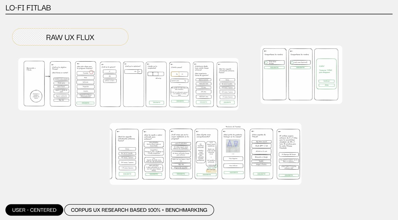
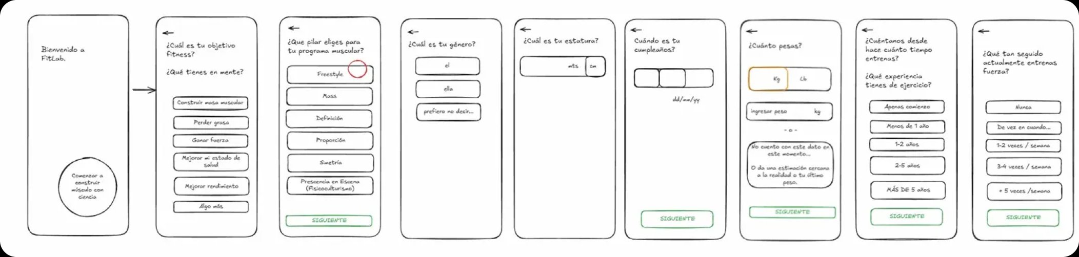
Before opening Figma, I mapped the entire experience on paper. Hand-drawn wireframes let me think about hierarchy, flow, and decision points without getting distracted by visual polish — a method I pulled directly from NNGroup's Design Thinking discipline.
Raw UX Flux — paper-first wireframes
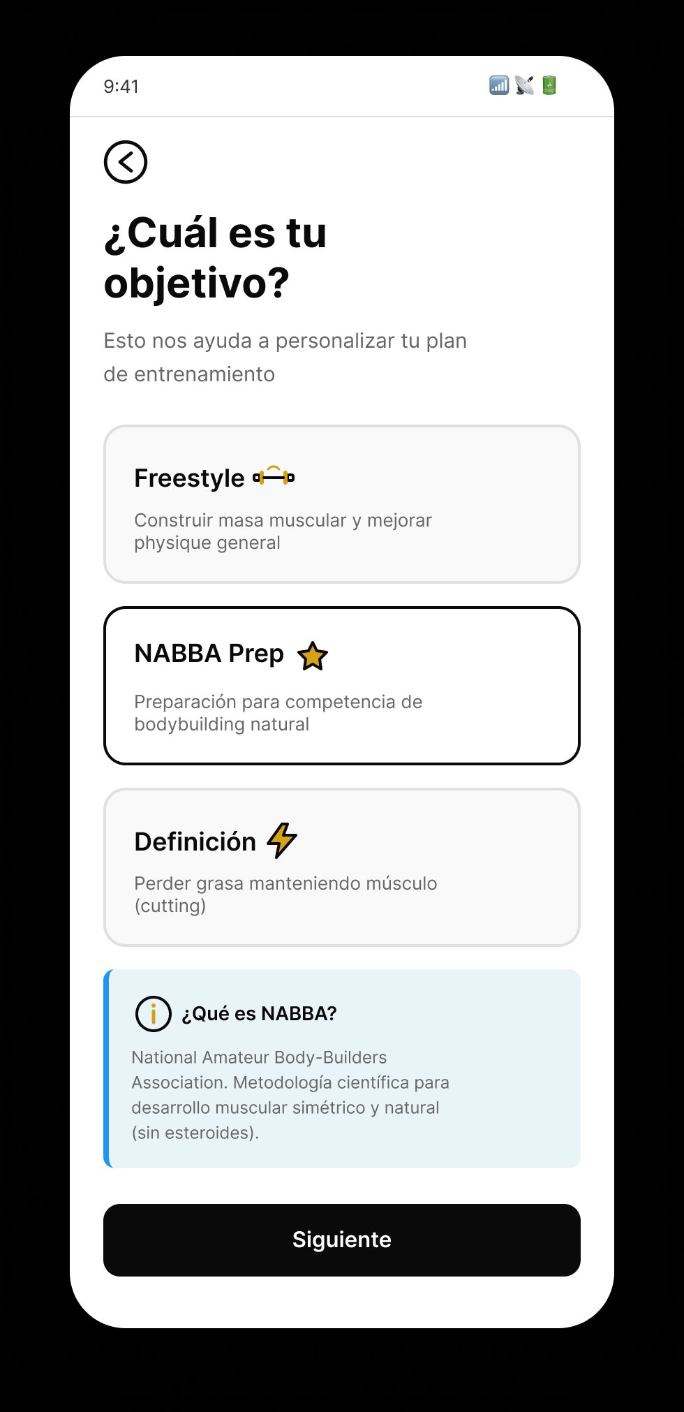
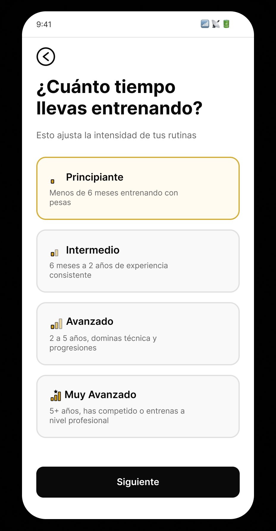
The full product flow sketched by hand: onboarding, objective selection, level, photo capture, motivation, accompaniment preference, and more than 15 decision points. Every screen in the final product traces back to a frame in this flux.
User-centered · Corpus UX research-based · Benchmarking-validated
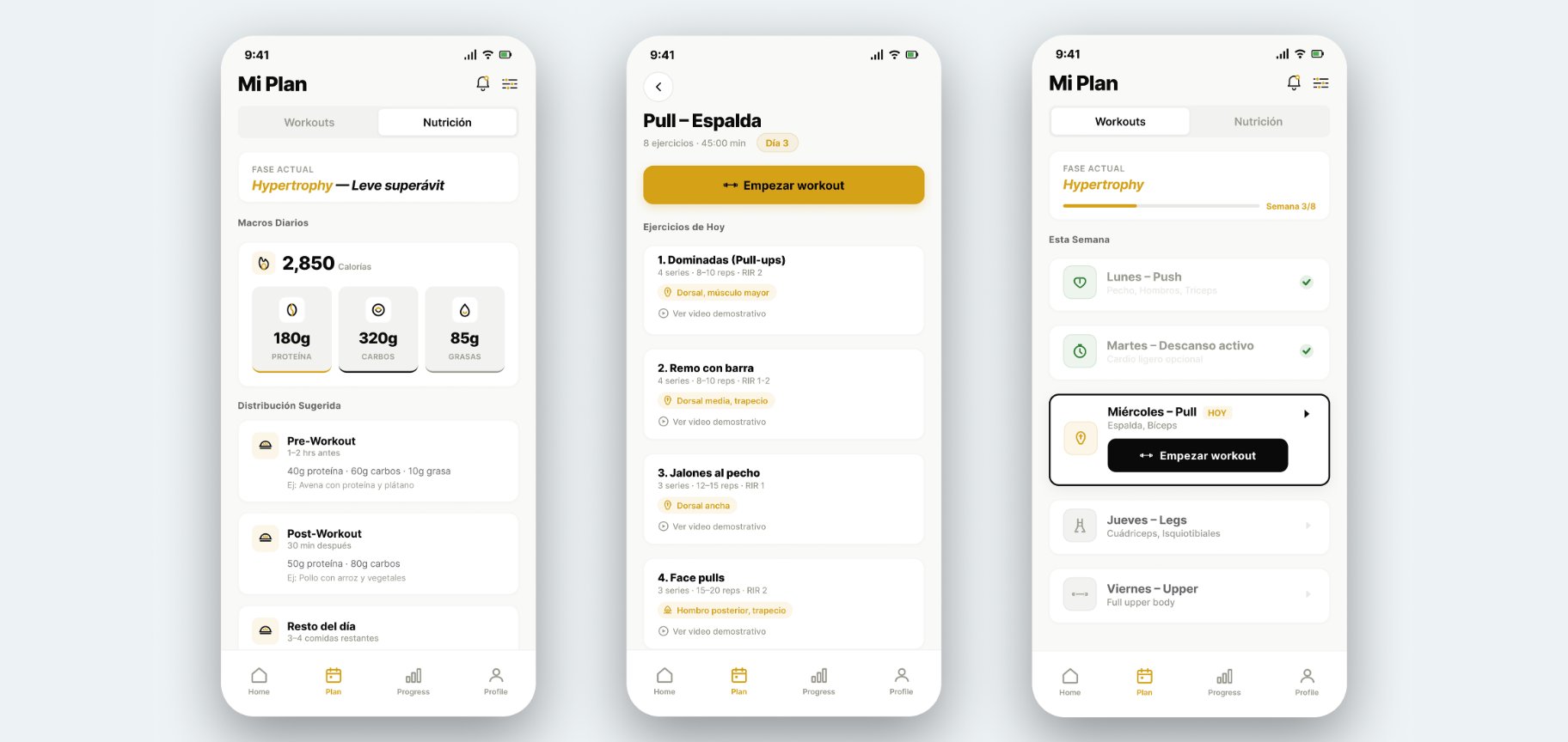
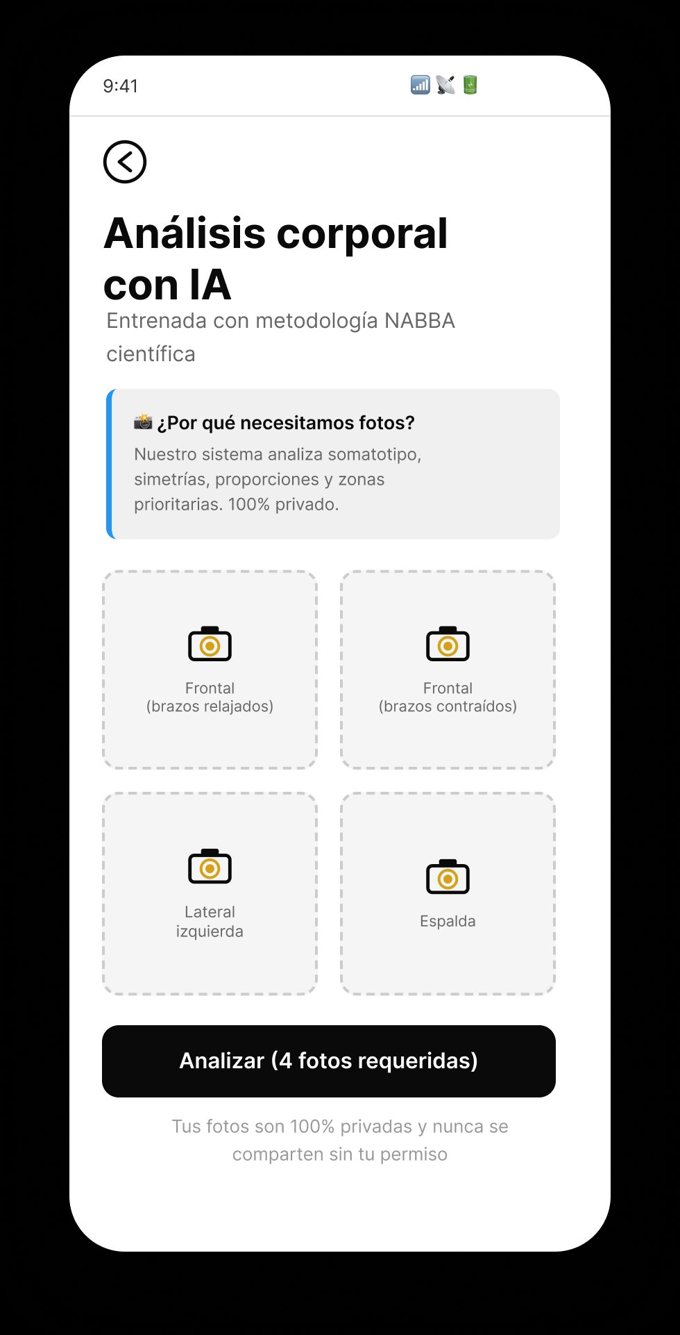
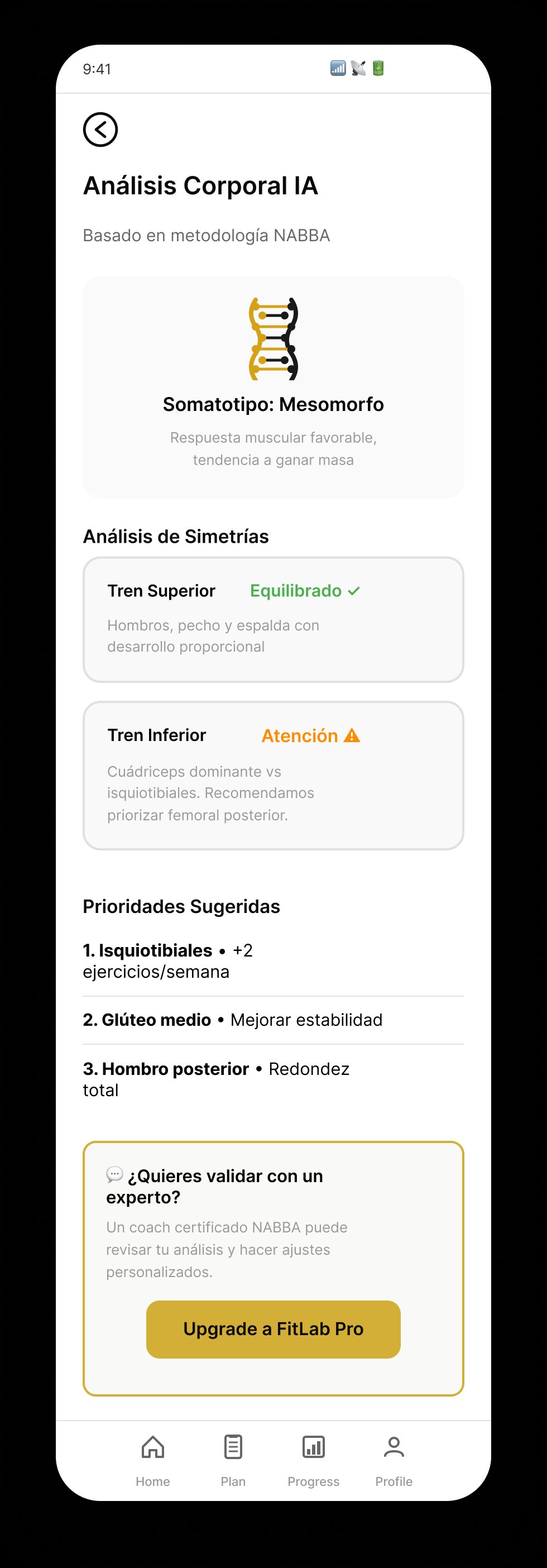
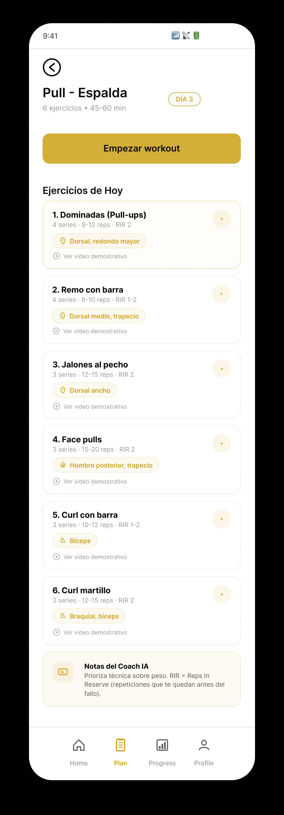
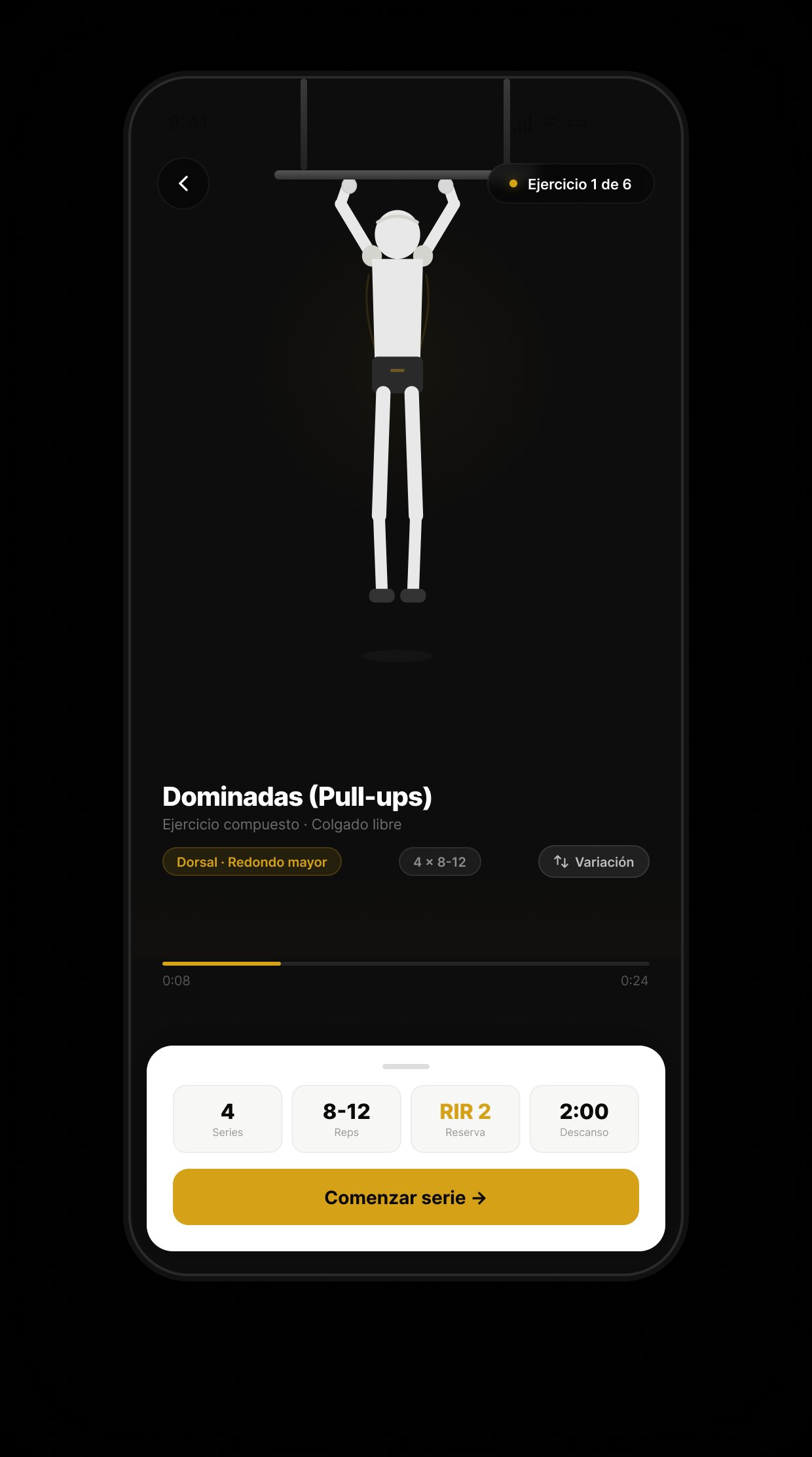
Mid-fidelity wireframes — validating the flow
Before jumping to hi-fi, I iterated on three mid-fi wireframes to validate the structure of the most critical screens: daily nutrition, workout detail, and weekly overview. Mid-fi lets you test hierarchy and information density without committing to the visual system yet.
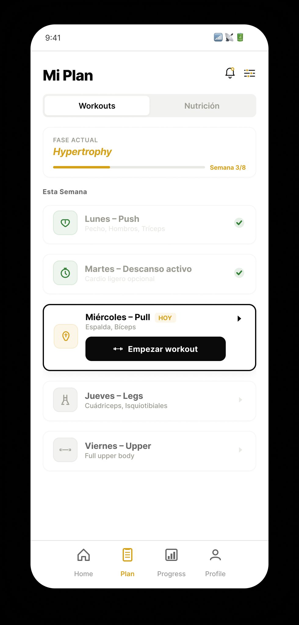
W09
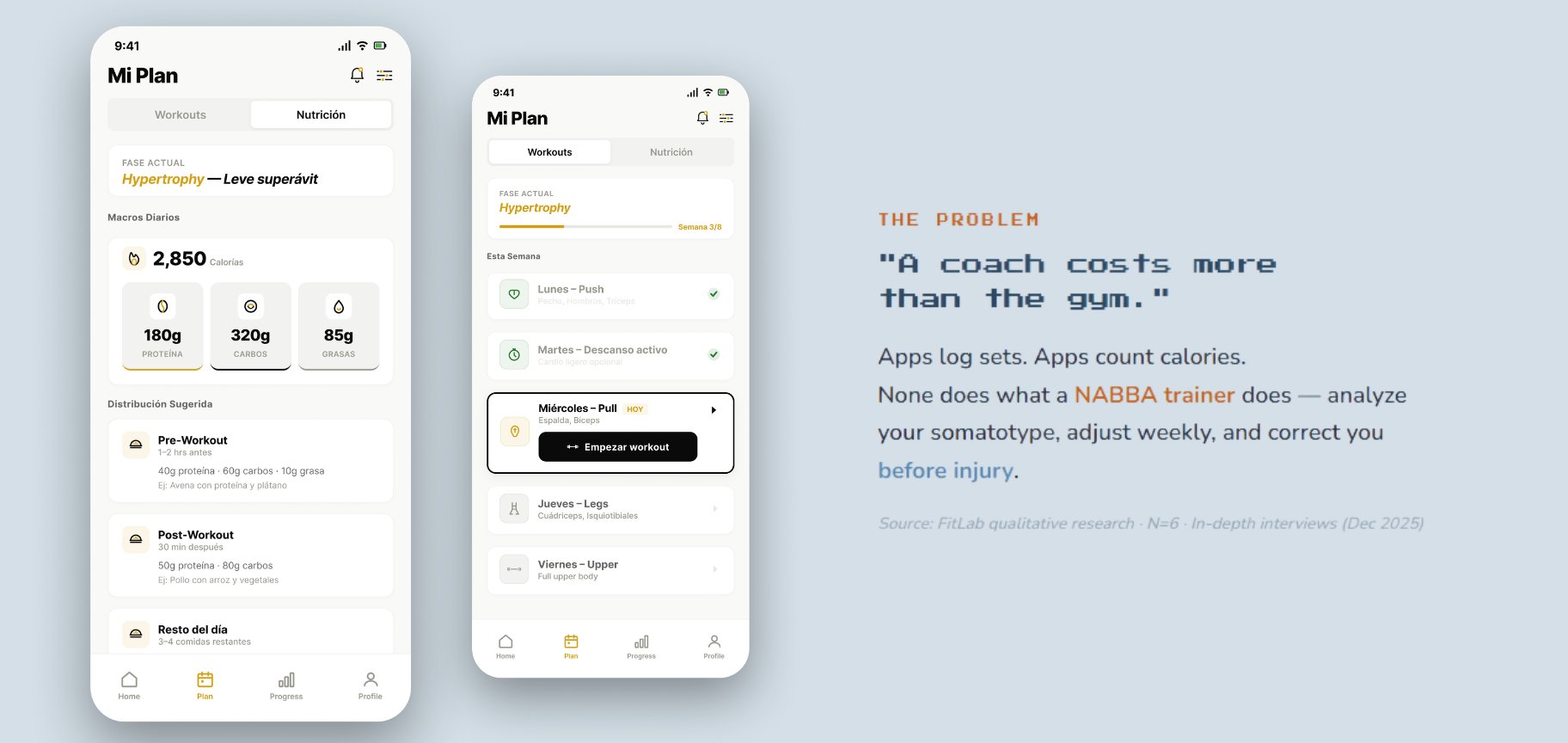
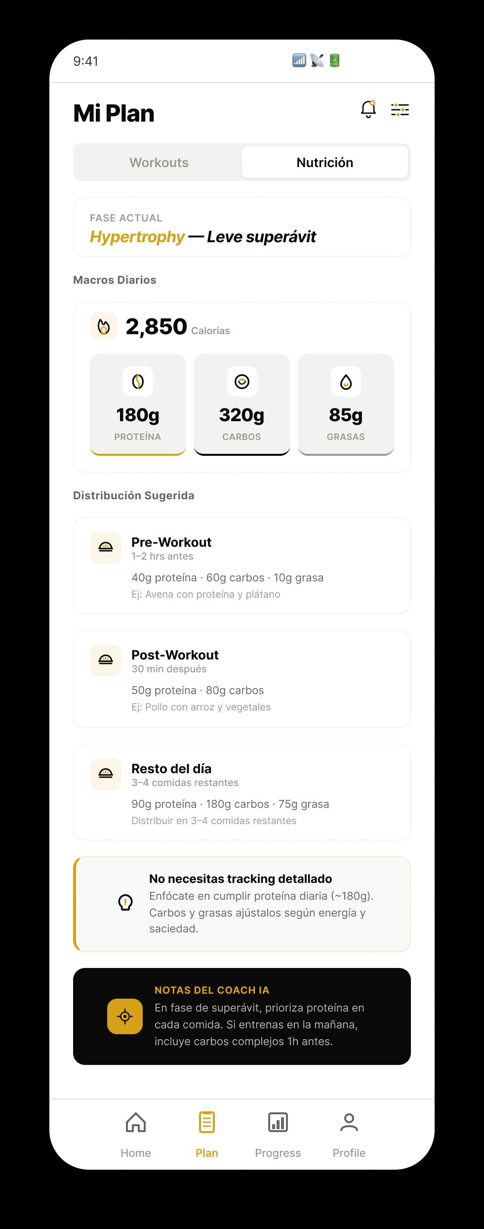
Mi Plan · Nutrition
Active phase, daily macros, pre/post workout distribution. Key decision: surface calories before macros to reduce cognitive load during the training window.
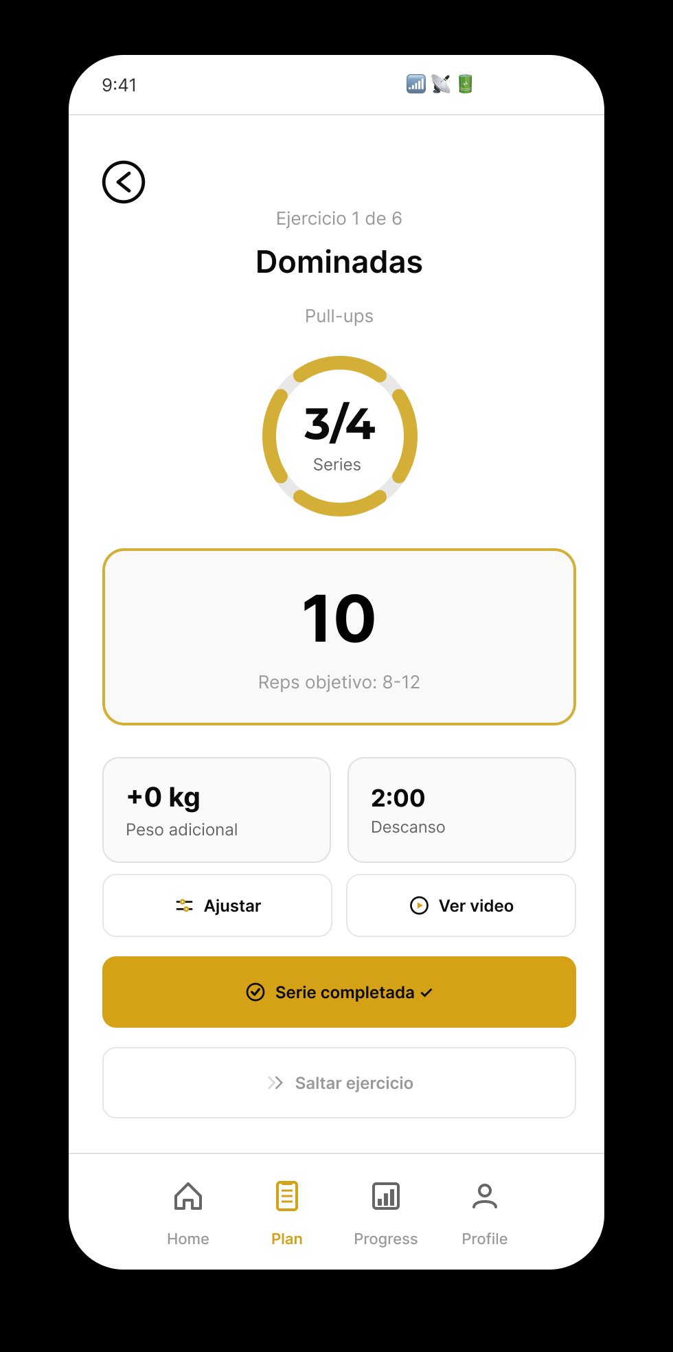
W10
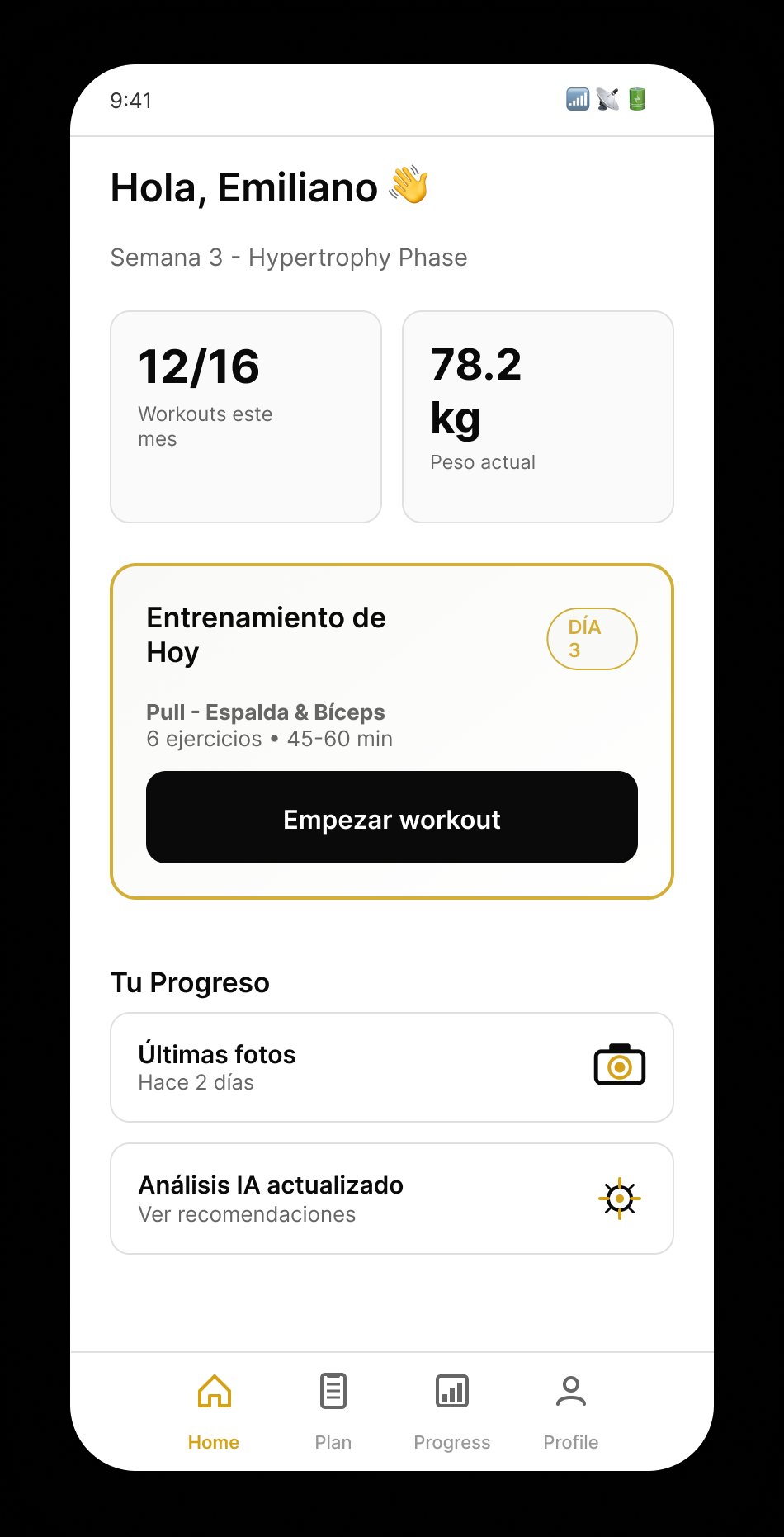
Pull — Espalda
List of 8 exercises with gold muscle tags, primary CTA to start workout, secondary to preview video. Test hypothesis: less than 2 taps to begin a set.
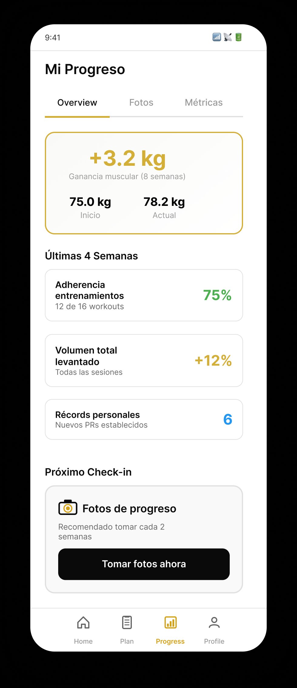
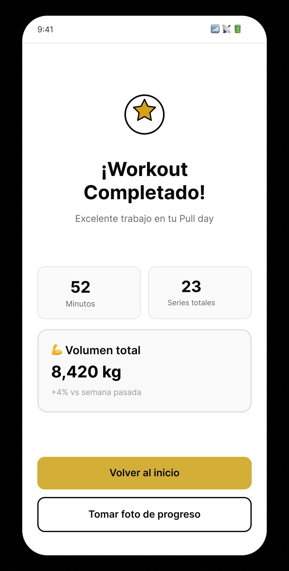
W08
Weekly Overview
Progress visible at first tap. Micro-copy "HOY" anchors temporal context. Completed states with cyan check for positive reinforcement without celebration overload.
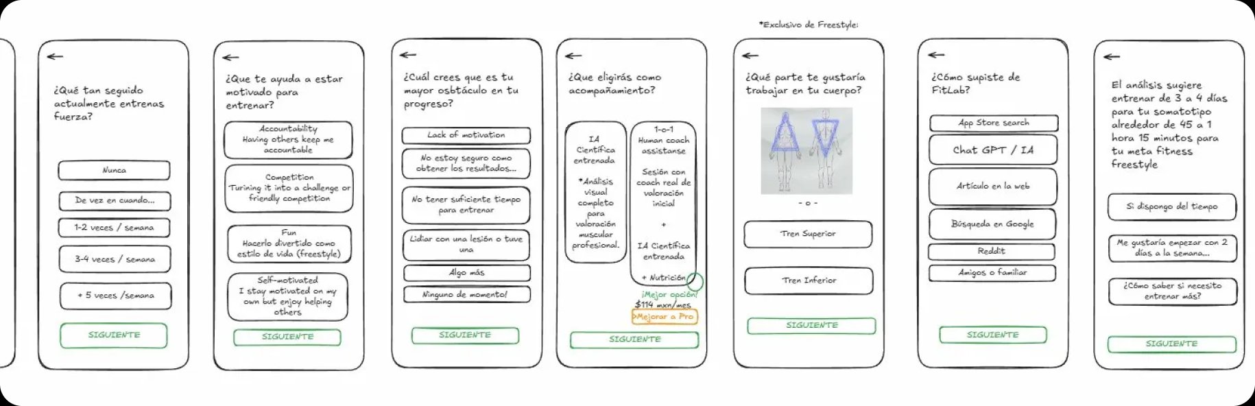
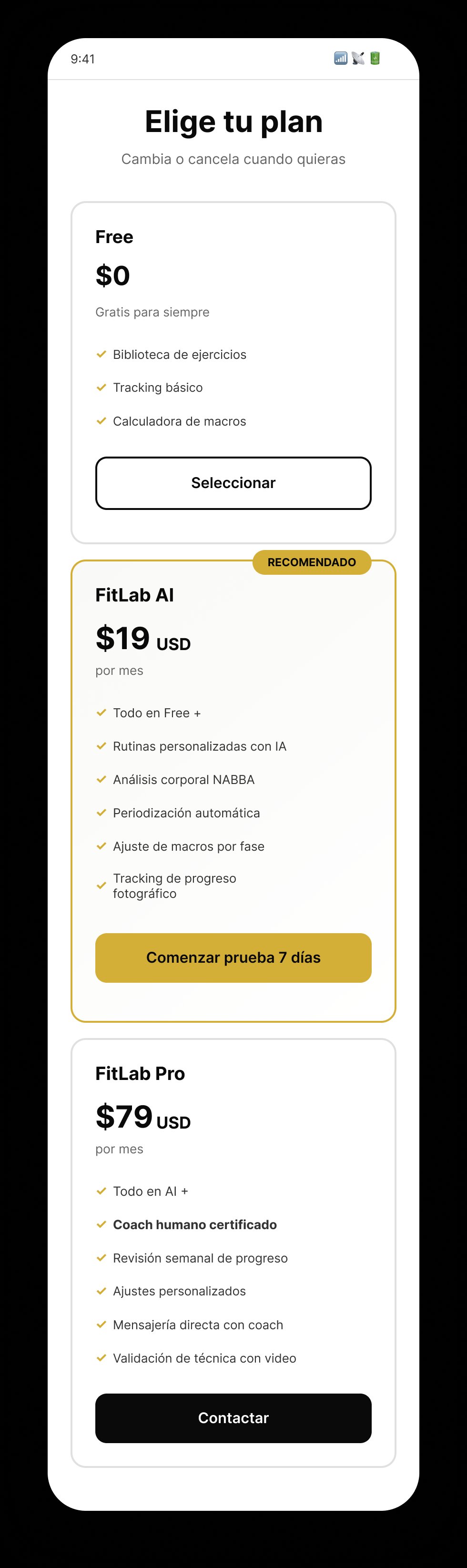
The pivot: from "AI solo" to "AI + Expert"
My first hypothesis was an AI-only product — faster to build, lower cost, scalable. Then the research said something the product direction couldn't ignore:
RESEARCH FINDING
100% of participants prefer expert human validation over pure AI recommendations.
AI Solo
✕
Algorithms without human validation generate distrust
→
AI + Expert
✓
Human validation layered on top of intelligent recommendations
This single finding reshaped the entire product architecture. The Pro tier — with a certified NABBA coach reviewing every AI analysis — wasn't a "premium feature" anymore; it was the trust layer the whole product depended on.
Design Thinking · 4 phases · 4 weeks
01
Discover
- 6 in-depth interviews
- Benchmark of 5 competitors
- Hypothesis validation
- Corpus UX documentation
02
Define
- Affinity mapping (16 insights)
- 3 user personas
- HMW statement
- Job stories + critical flows
03
Design
- Paper wireframes (lo-fi)
- UI kit + design tokens
- 17 hi-fi screens
- Component system + Smart Animate
04
Test
- Clickable prototype
- Usability validation (N=3)
- 100% task completion rate
- Iteration backlog for v2
Clickable Figma prototype → real users
Beyond the metrics cards above, I built a clickable Figma prototype of the full flow and walked a handful of users through it — qualitative feedback only, not instrumented metrics. The main takeaways informed the focus-mode iteration and the 2-tap logging decision documented in the Learnings section.