A comprehensive redesign project for a B2B SaaS platform serving clinical nutritionists. Scope covered landing page, purchase flow, cart abandonment recovery, clinical consultation flow, AI-powered search, calendar optimization, icon system redesign, and a new design system from scratch.
First deliverable results: 87% fewer clicks in the critical flow, SEQ 5.7/7, and a scalable design system powering the entire platform.
A B2B SaaS platform serving clinical nutritionists across LATAM. The existing product had multiple friction points: a landing page that failed to communicate value, a purchase flow with high abandonment, a clinical consultation flow requiring 30+ clicks for a basic task, and disconnected scheduling that created workflow bottlenecks.
The project was framed as a comprehensive redesign — not a patch — addressing acquisition, conversion, retention, and operational efficiency simultaneously.
8 workstreams unified by a single design system: landing page, purchase flow, cart abandonment recovery (HTML email strategy), clinical consultation flow, AI-powered search button, calendar/scheduling optimization, icon system redesign, and full design system.
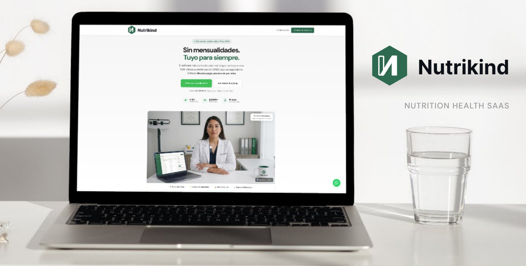
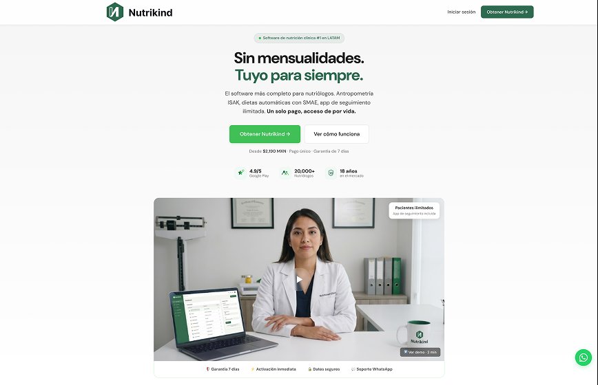
Landing page redesign + value proposition
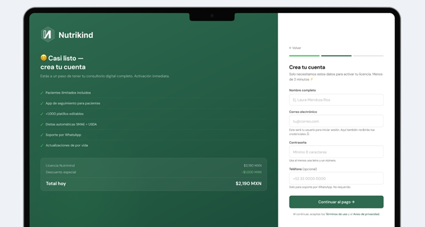
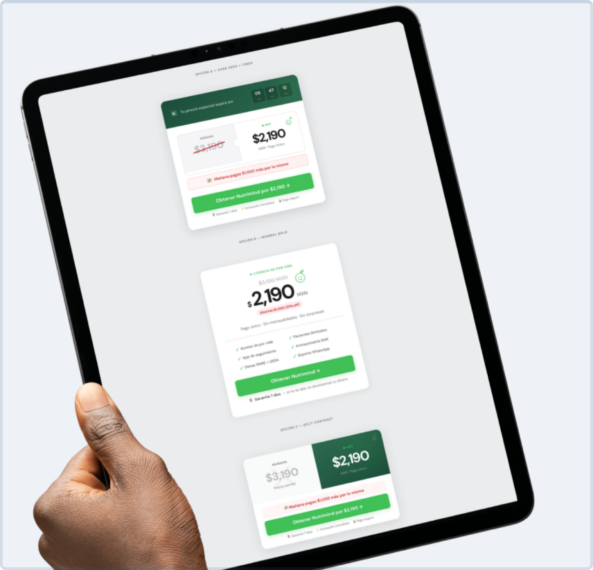
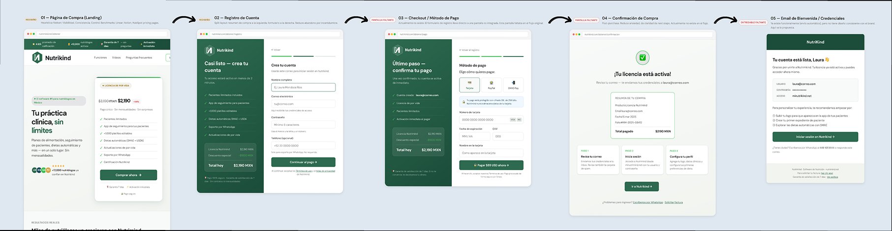
Purchase flow + cart abandonment + email recovery
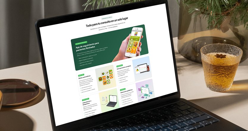
Clinical flow + AI search + calendar + icons
International qualitative research following NN/g protocols across 5 countries, capturing diverse clinical workflows and regional differences in nutritionist practices.
My experience as a clinical nutritionist (1,800+ consultations) allowed me to ask questions a designer without clinical context would never ask — and detect problems users had already normalized.
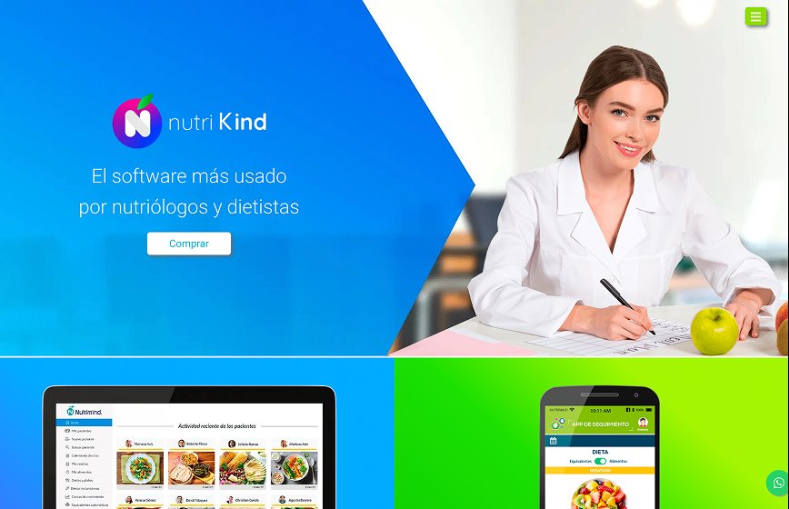
The original landing page failed to communicate product value clearly. Nutritionists didn't understand what problem the platform solved in the first 5 seconds — a critical conversion failure.
The freemium model had a problem: users tried the product for free but the upgrade to premium was confusing and the paid plan's value wasn't clear. We also designed a complete cart abandonment recovery strategy.
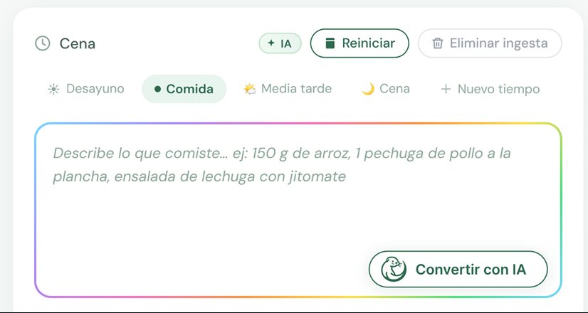
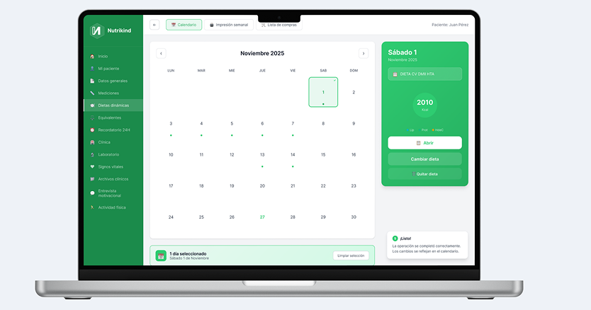
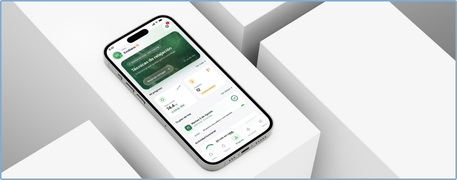
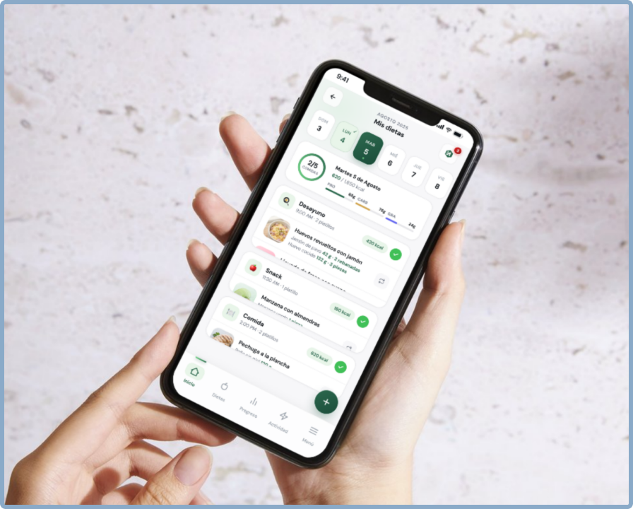
The highest-impact intervention targeted the most repeated task in a nutritionist's week: adding and removing diets from a patient's plan. The original system buried this action under 30+ clicks spread across 4 screens — a detour through menus, nested lists, and confirmation modals every time a plan changed. I redesigned it as a single-surface flow in 4 clear steps.
Three additional workstreams that improved operational efficiency and brand consistency across the platform.
Redesigned the platform's search experience with an AI-powered button. The new design maintains the existing UI color system while incorporating a custom brand detail inspired by the company's mascot identity — combining familiarity with a distinctive touch.
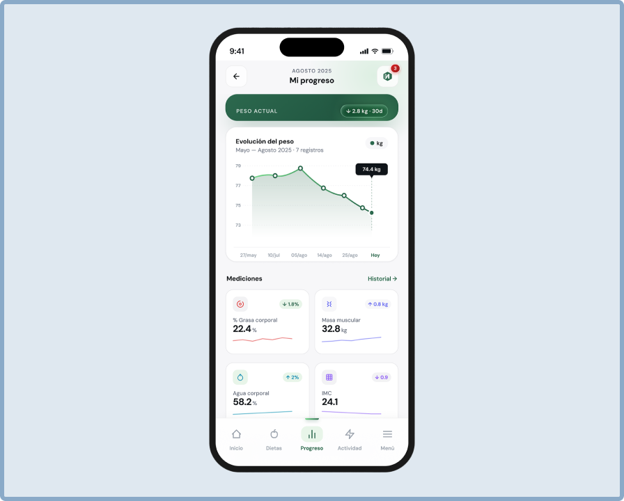
Redesigned the appointment scheduling flow to reduce no-shows and improve nutritionist workflow. Optimized the calendar view for clinical workflows where back-to-back consultations are the norm.
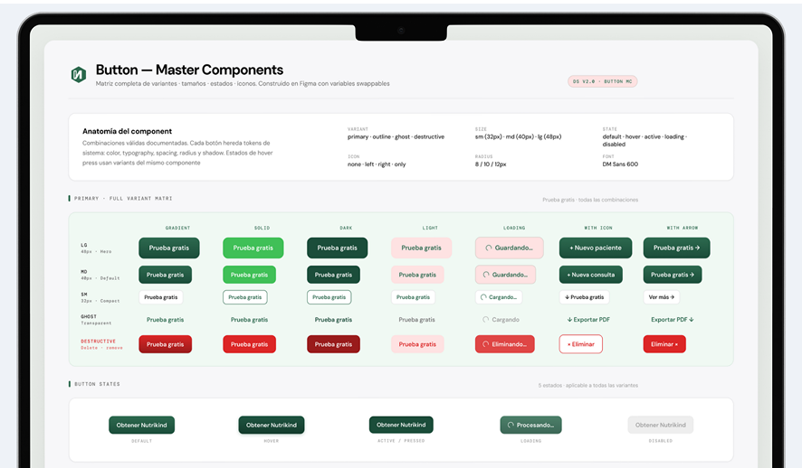
Redesigned the platform's icon library to improve visual consistency and support the design system. Each icon follows unified stroke weight, corner radius, and optical sizing rules.
▸ Live preview · hover to try
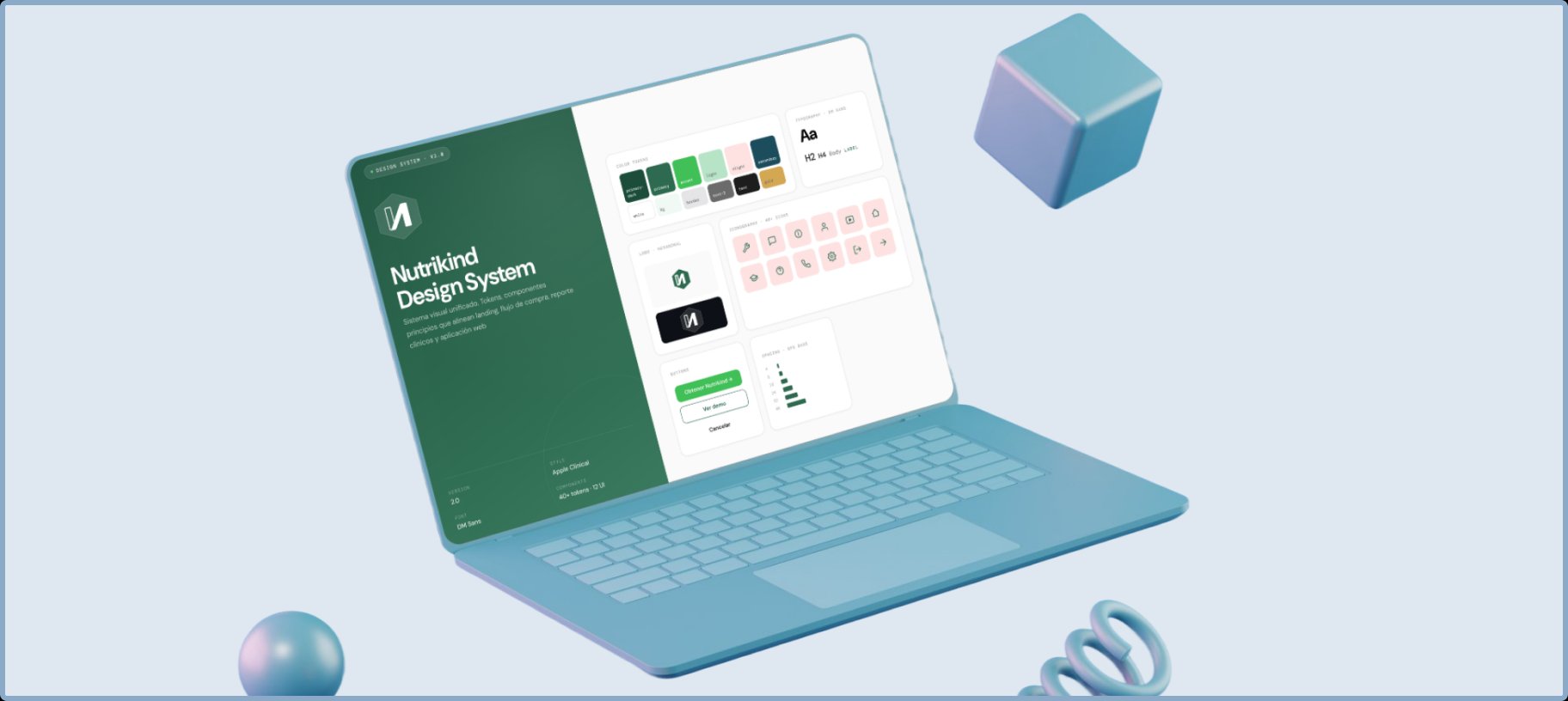
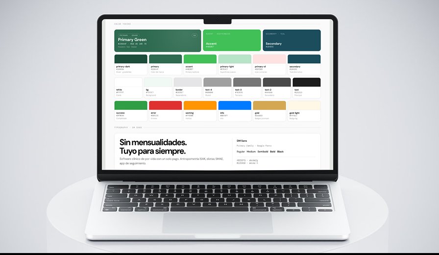
Built as the foundation for the entire redesign — landing, purchase, and clinical app share the same visual system:
Basic mobile prototype designed for nutritionists who need to access patient data and log consultations on the go. Responsive adaptation of the core clinical flows.
Iterative approach: each workstream cycled through wireframe → validation → UI → testing. All workstreams shared research findings to maintain coherence.
Validated results from the clinical flow (first completed deliverable):
Landing page, purchase flow, and cart recovery are in implementation. Conversion metrics pending post-launch measurement.
This project confirmed that domain expertise is a real multiplier. Having lived 1,800+ consultations as a nutritionist allowed me to detect friction that users had already normalized — and propose a redesign that doesn't just improve the interface, but rethinks the product's core logic.
The most valuable learning: a comprehensive redesign works best when the design system is built first. Shared tokens and components across landing, purchase, and clinical app guarantee visual coherence and accelerate production across every workstream.