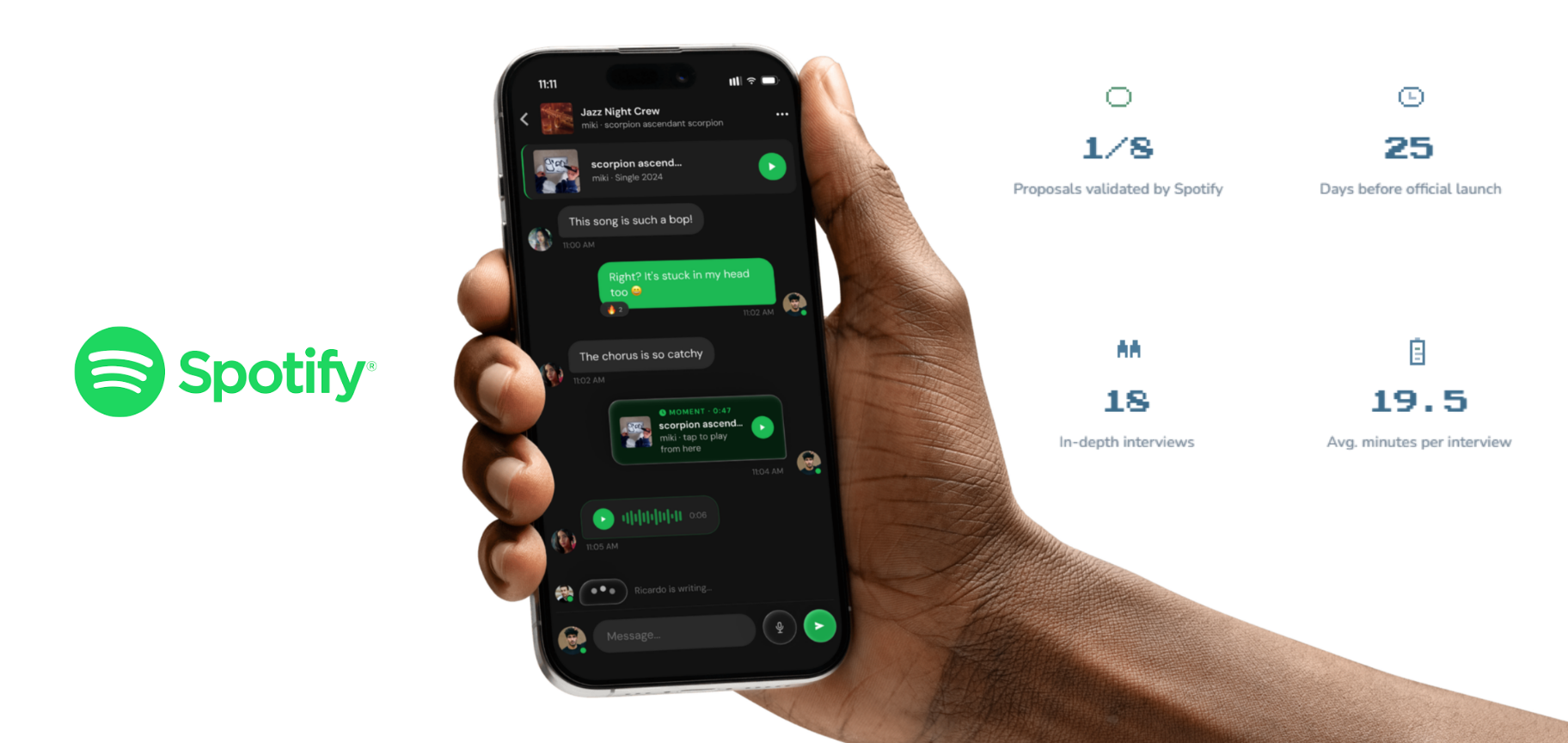
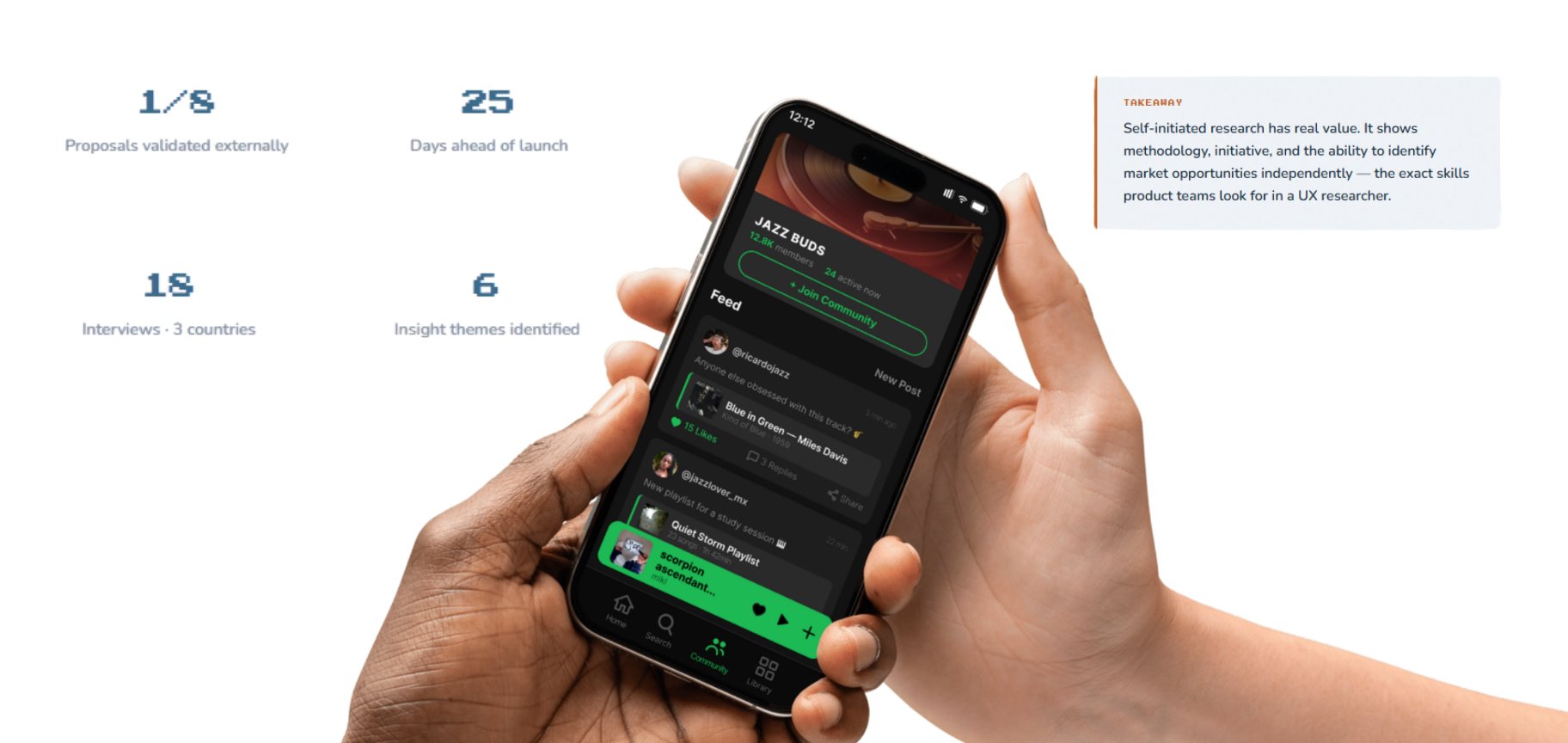
A generative qualitative study of 18 Spotify users across 3 countries — exploring habits, needs, and pain points with no prototype in mind. The outcome: eight research-backed UX proposals. Twenty-five days after delivery, Spotify launched one of them as an official feature.
Key result: My social messaging proposal matched "Spotify Messages," launched Aug 26, 2025. The research identified the need, the behavior, and the solution space before any public roadmap revealed it.
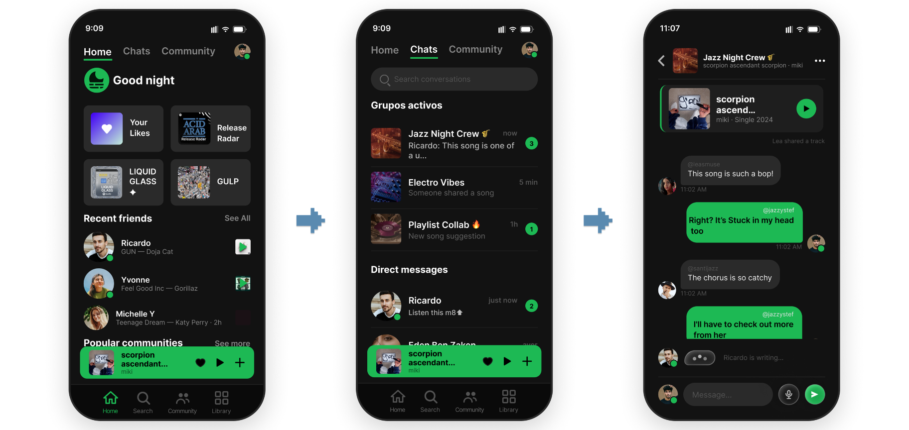
On August 1, 2025, I delivered a research brief identifying a clear pattern across 18 interviews: users wanted in-app social features. Specifically, a dedicated space to share music with friends without leaving Spotify. I proposed a messaging interface as part of the deliverable. Twenty-five days later, Spotify launched exactly that — calling it "Messages."
This wasn't a product forecast. It was generative research done right: listen, synthesize, translate into design. Spotify's internal product team independently arrived at the same solution — on the same timeline.
Users have told us that they want a dedicated space within the app to share their next favorite song, podcast or audiobook with friends and family, and an easy way to keep track of recommendations.
— Spotify Newsroom, announcing the launch of Messages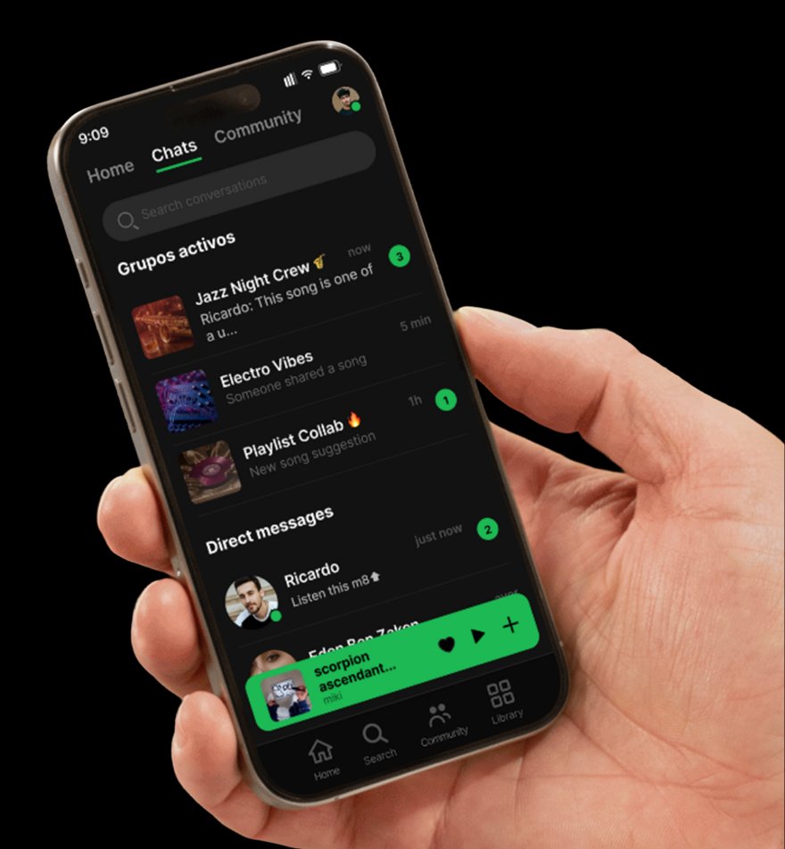
Research goal: understand how users of different profiles use Spotify — what they love, what frustrates them, and how the experience could be improved. Qualitative and generative — no prototype under test, just deep exploration of habits, needs, and pain points.
The sample was deliberately diverse: students, creatives, professionals, and older adults. Mixed Premium and Free accounts. The goal was not statistical representation — it was a rich qualitative picture of how different people actually live inside Spotify.
Synthesis surfaced five recurring behavioral profiles across the sample. Each has distinct habits, distinct pain points, and distinct expectations of the app.
Six themes emerged across interviews. The social sharing insight was the strongest — and the one Spotify would validate 25 days later.
The most frequently mentioned frustrations, ranked by how many of the 18 participants brought them up unprompted.
Other individual pain points: difficulty removing songs from Liked while on CarPlay · distrust of specific recommendations · unawareness that certain features even exist.
Four quotes that capture the texture of the frustration — and the aspiration behind the research.
"It keeps repeating the same order of songs and I don't like that, it feels really wrong. I'd like much more variety — I've noticed the app does this multiple times."
"The Explore section feels super saturated, awful. It has an excess of colors that make it look cheap. I don't enjoy it, I don't like that section. It has to improve a lot."
"Sometimes the search is frustrating because there are songs with the same title and you have to type very specific parts to find them. With an artist called Lucas King, I have to write his full name or nothing shows up."
"In my Discover Weekly I keep getting artists I already know and already follow; they're not new."
I always end up sending links through WhatsApp, but it would be great to chat about the song directly in Spotify without leaving the app.
— Research participant (26). This pattern, repeated across interviews, became the foundation of the social proposal later validated by Spotify.Eight proposals translated from research insights. The first — integrated social features — was the one Spotify validated at launch. The other seven remain open opportunities.
The strongest insight in the entire study. Users weren't asking for a messaging feature — they were describing a workflow they already had (sharing songs via WhatsApp) and hinting they'd rather do it inside Spotify. The proposal mapped that behavior into two flows, six screens, and three contextual micro-features specific to music.
User arrives at home and sees social activity from friends integrated into the music feed. No app-switching, no friction.
User discovers themed communities, joins, and participates with music-backed posts. A new vector for engagement that doesn't exist in the current product.
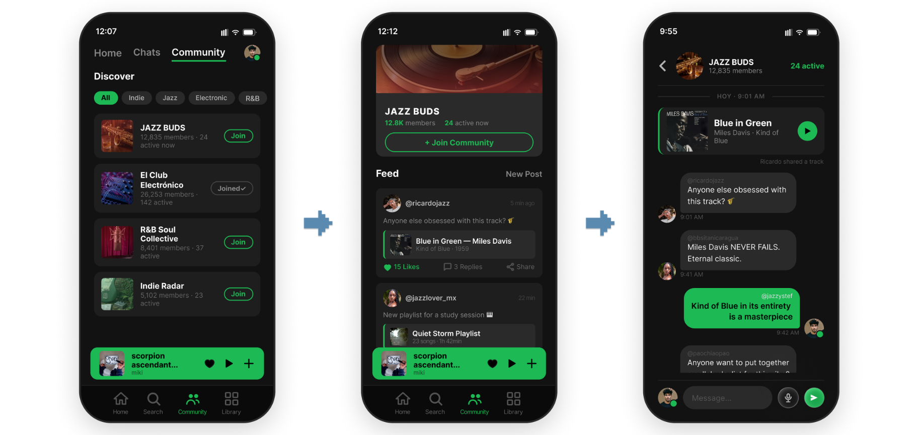
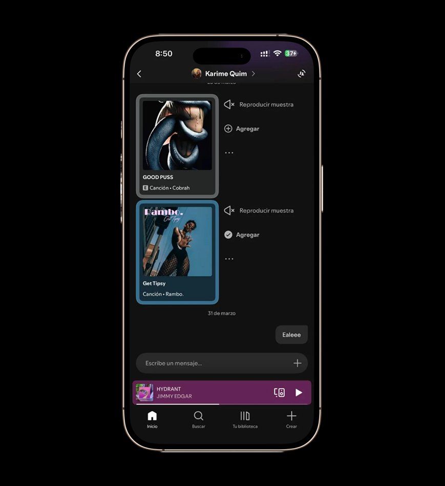
The Jazz Buds community feed in the hands of a real user — a music-forward space that feels social without replacing the messengers users already love.
Spotify's Messages launch confirmed the underlying need, but stopped at generic text chat — the same experience you'd get on any messenger. The research pointed further: three micro-features native to music that no messenger provides.
Reduce excessive repetition and improve suggestion diversity. Add a "never recommend this again" option on songs and artists — giving users a direct lever to actively train their algorithm rather than silently suffer its decisions. This addresses the most frequent pain point in the study (28% of participants, 5 of 18 users).
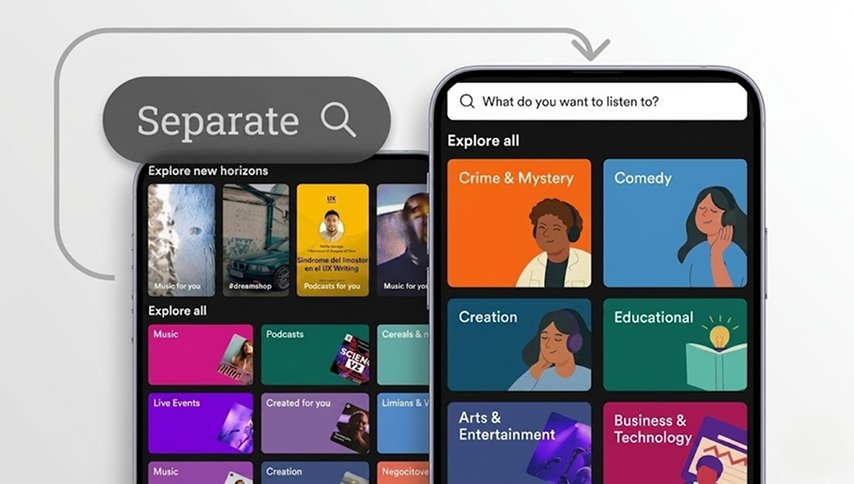
Simplify the discovery interface with clearer hierarchy and less visual saturation. Replace generic category lists with mood-based, activity-based, or illustration-led categories so discovery feels inviting, not overwhelming.
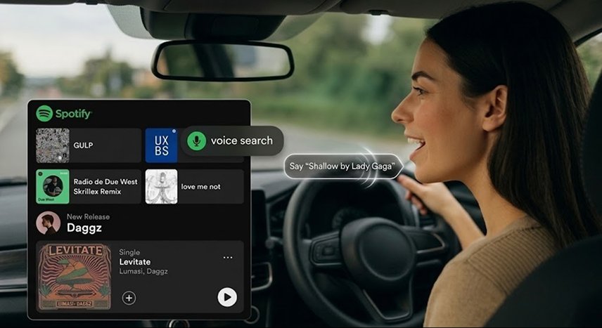
Add a visible, reliable voice search button — critical for hands-free scenarios like driving. Improve text search to accept partial titles, lyrics, and common typos. For example, finding "Shallow Lady Gaga" when the exact title is missing.

A hands-free moment: driver says "Shallow by Lady Gaga" and Spotify responds without a screen tap. This solves the most cited pain point from Functional Users who use Spotify primarily during commutes.
Multiple participants flagged frustration at not being able to remove songs from "Me Gusta" while driving — a common scenario when a song they no longer like plays. A persistent dislike/remove button solves this specific pain point.

Dedicated tabs or sections for music, podcasts, and audiobooks so formats don't invade each other's recommendations. Audiobooks resume from the last position. Podcasts stay in their own context. A clean mental separation that matches how users actually listen — surfaced consistently by the Podcast/Narrative Lovers profile during interviews.
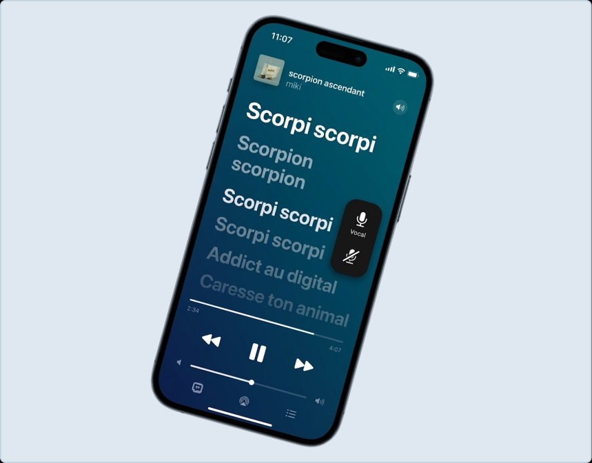
Users can silence the vocal track and see full-screen synced lyrics. Appeals strongly to the Emotional Creatives segment, adds a playful dimension to the app, and pulls users who currently switch to YouTube or Musixmatch for this experience back into Spotify.
Several participants expressed frustration at not being able to easily return to a recently played song. The current history is buried in menus. A fixed, accessible button directly on the player resolves this pain point — no lost discoveries, no "wait, what was that song?" moments. Small addition, disproportionate impact on perceived app reliability.
The brief closed with a recommended continuation — the same steps a product team would take to turn generative research into shipped improvements.
Spotify reported that nearly 40 million users sent 340 million messages in the first five months of the feature — confirming retrospectively that the behavioral need surfaced in this research was not a niche observation, but a pattern at massive scale.
The point of this project was not to predict Spotify's roadmap. That was a byproduct. The point was to demonstrate that rigorous, user-centered research — even self-initiated, without access to internal data — can surface real needs that align with major product decisions.
The methodology is the same one I bring to any project: listen deeply, synthesize with proven frameworks, and translate insight into concrete design proposals. When Spotify's product team independently arrived at the same conclusion I did — twenty-five days later, and 40 million users proved the behavioral pattern five months after — that wasn't luck. That was the research being done right.
Self-initiated research that matches product decisions at scale demonstrates what I'd bring to any team: rigorous method, early pattern detection, and the ability to translate user behavior into concrete, testable design proposals.
Full research deck and portfolio links: